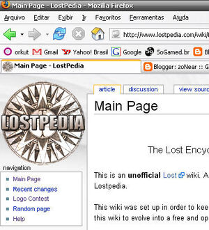
Logo E
| http://kinkajou.ois.uri.edu/~cvr/lost-maincarl2.png |  Preview - PS: the backgroun of this logo is not transparent by Template:Z0n3 |
Back to the Voting Summary gallery
Cast your votes here
- You can leave a comment with your vote, like this. --Admin 21:10, 6 May 2006 (PDT)
- This one (E) utilizes the space most ideally. Best illuiminates the title of the site. Doesn't use a visual cue that might become outdated in the future like the island, or the airplane, or the numbers, or the swan (elements which may not always be central to future seasons) a misguided compass is the best choice for a visual cue of a show called Lost. That narrows it down to three. D utilizes the island motif so I couldn't choose that. K was too busy and too wordy. E is the only logical choice available. ZachsMind 23:34, 6 May 2006 (PDT)
- Seconded. And how can I not vote for my own? Carl 10:26, 12 May 2006 (PDT)
